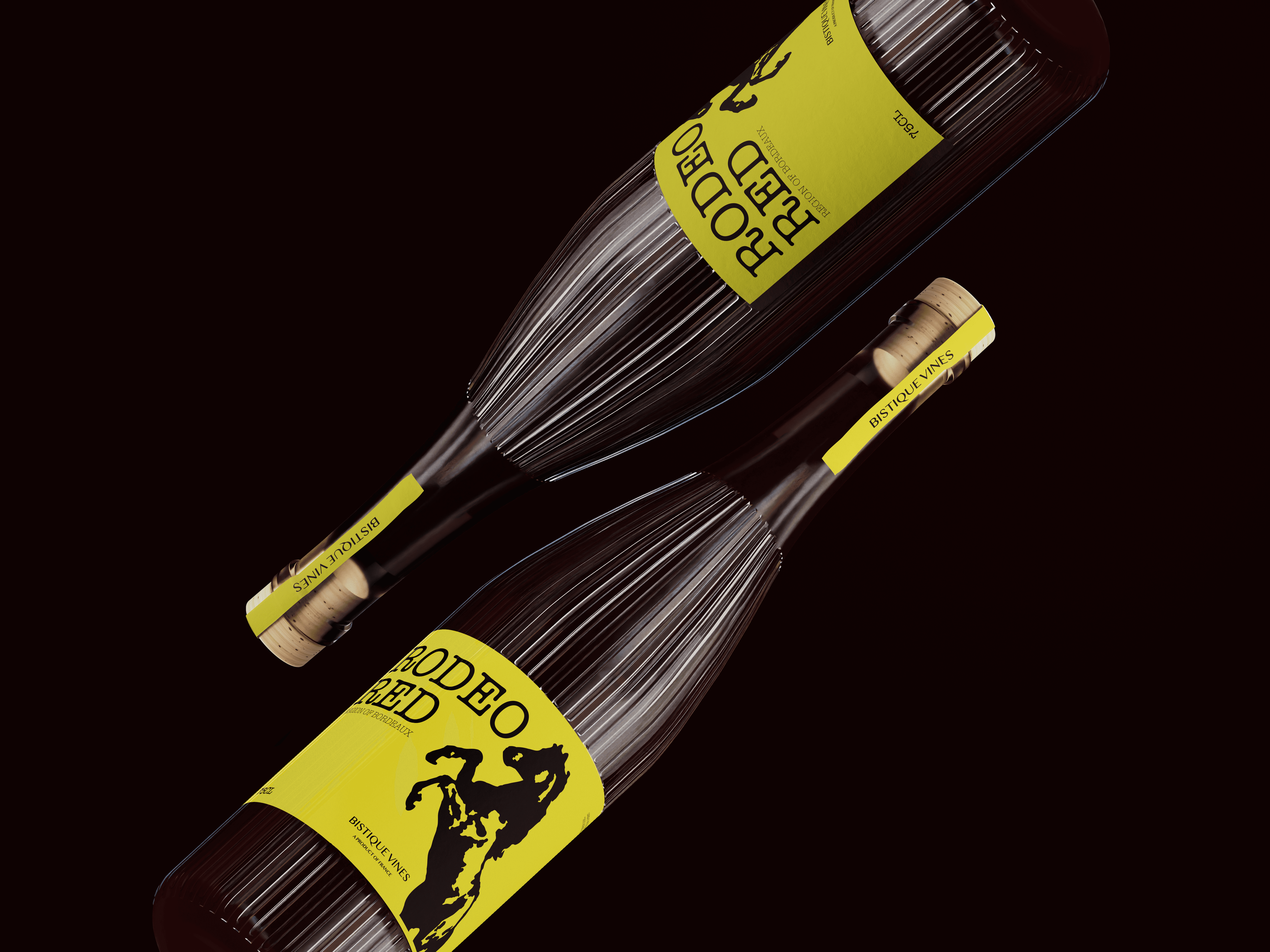
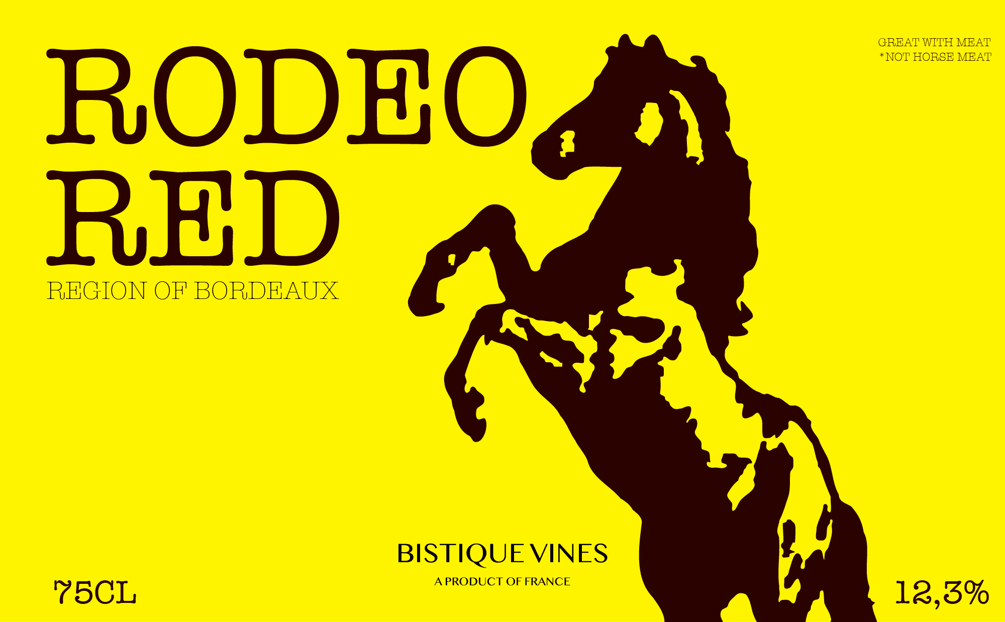
Bistique Vines
I took on the challenge of visualising and constructing a brand for a hip wine brand as part of my passion project. I gave myself 1 hour to design an impactful design that would stand out in between the classic wine brands and design on the shelf. I opted for a bright screaming yellow colour, which may be risky but definitely does bypass your vision when shopping for wine.
00
problem
How can a wine brand stand out in between the classic wines with years of experience and history? The battle of white creamy labels with classic fonts and illustrations of French castles on the shelves in the supermarket is hard to beat. It shows the history and experience new brands don't have. How do we beat them?
solution
By taking risky but calculated design choices, your product can stand out in between the rusted safe design choices of your competitors. It shows that your brand is different and new, but that sparks curiosity which suggests the prospect to try something new over the classic safe options.
Make it pop!
* Concept yet to be elaborated
year
2025
timeframe
1 hour
category
Branding and Identity
01

02